Personalized Learning 2 App
Online learning platform to support mentors teach math to students
Sponsored by
I redesigned the Personalized Learning 2 or PL2 platform, where this app facilitates mentors to tutor students in secondary schools by providing them with credited online resources.
My Role
UIUX Designer & Researcher
• Redesigned full user experience & interface
• Conducted user research to develop new features
• Improved usability with user feedback
Timeline
May 2019 - February 20202 t
Tools Used
Adobe XD
Figma
Adobe Photoshop
Adobe Illustrator
Skills
UX Research & Interviews
UIUX Prototyping
Wireframing
Lean Team Collaboration
Collaborators
Lesson Planning Tool
Mentors can select what teaching strategies they want to use and add it to that week's lesson plan.


Sorting and Filtering Resources
Mentors can choose from sorted strategies to get guidance on students' learning or to help themselves.


The top of a student's profile page will always show the progress of the student in visual format. There are more detailed graphs to show the overall progress trend of students.
More Hierarchy & Visuals
The Problem
Platform lacking accessibility and not user-friendly
The web app was at its beginning stages where it lacked many features that was necessary to help mentors teach students such as a lesson planning feature, and a system to find a resource a teacher is looking for out of the hundreds of resources. The interface of the web was unintuitive to use, for example having inconsistent buttons, and a layout that was hard to read.
Process
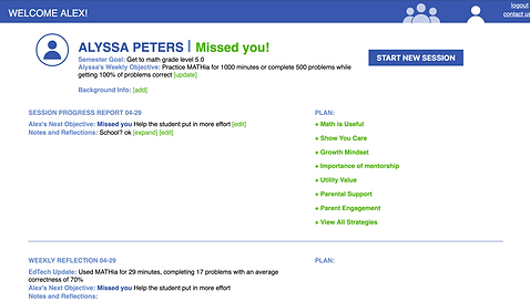
Student Profile Page: Improving on the Lesson plan and Student Progress Features


Previous interface design
The web app was at its beginning stages where it lacked many features that was necessary to help mentors teach students such as a lesson planning feature, and a system to find a resource a teacher is looking for out of the hundreds of resources. The interface of the web was unintuitive to use, for example having inconsistent buttons, and a layout that was hard to read.
Old Interface
My Redesign


Decreasing information load by adding more visuals and larger clusters

Progress summary always at the top of the page
I started sectioning off all the data from the page into "blocks" such as current week, history, and the strategies the mentors can use. Then I experimented with a lesson planning function and including more visual component to the information.
Current Implemented Profile Page Designs

Current student progress fixed at the top with the option of seeing overall progress

Add resources to your plan with the history log of used resources at the bottom
The final version kept the main section of having the current week's progress always at the top to allow mentors to access necessary information right away. The progress was placed into tables to make it more readable. The goal of that semester and what the student did in the most recent lesson is also at the top for emphasis. There are recommended strategies that are shown how relevant they are to the student's learning status. The mentor can also dismiss the displayed recommendations to show other options.
Mentor Resource Page: Creating Organization


The previous design on accessing mentor resources
Above shows the original process to access a mentor resource. You click on 'View All Strategies' in the student profile page then select a specific category. These categories were titled in vague names that added to the confusion in using the app. Once you click onto a resource you can preview it and open it in a new window or add it to the 'Plan'. If you added it to your 'Plan', it would be highlighted blue.
Overall, the mentor strategies was a large pool of resources with no organization or filtering function. It was difficult for mentors to find what they needed and to understand how to use them. Feedback from current mentors using PL2 said that that they did not understand the point of the web app because it was lacking clarity and functionality.


The bar reflects how relevant a recommended resource is to a student progress
Leads to a pop up for a sorted storage of resources
The dismiss button allows mentors to pick and choose recommendations


Adding a reflection activity for this resource
When you click on a strategy, the strategy opens as a pop up with a list of resources and functions related to that resource. For example, there are activities for each resource option, you can write your own notes or add your own links/resources.
Current Implemented Profile Page Designs


Updated version of the mentor resources
Condensing the categorization by including them on the same page
Simplified navigation by adding 'activities' to the front of the resource page
The most recent designs decrease the cognitive load for the users significantly. There are less descriptors to read and less areas that users can interact to allow users to focus on the most important features.
Conclusion and Major Takeaways
Click on image to see larger view

