21st Century:
Words about Women
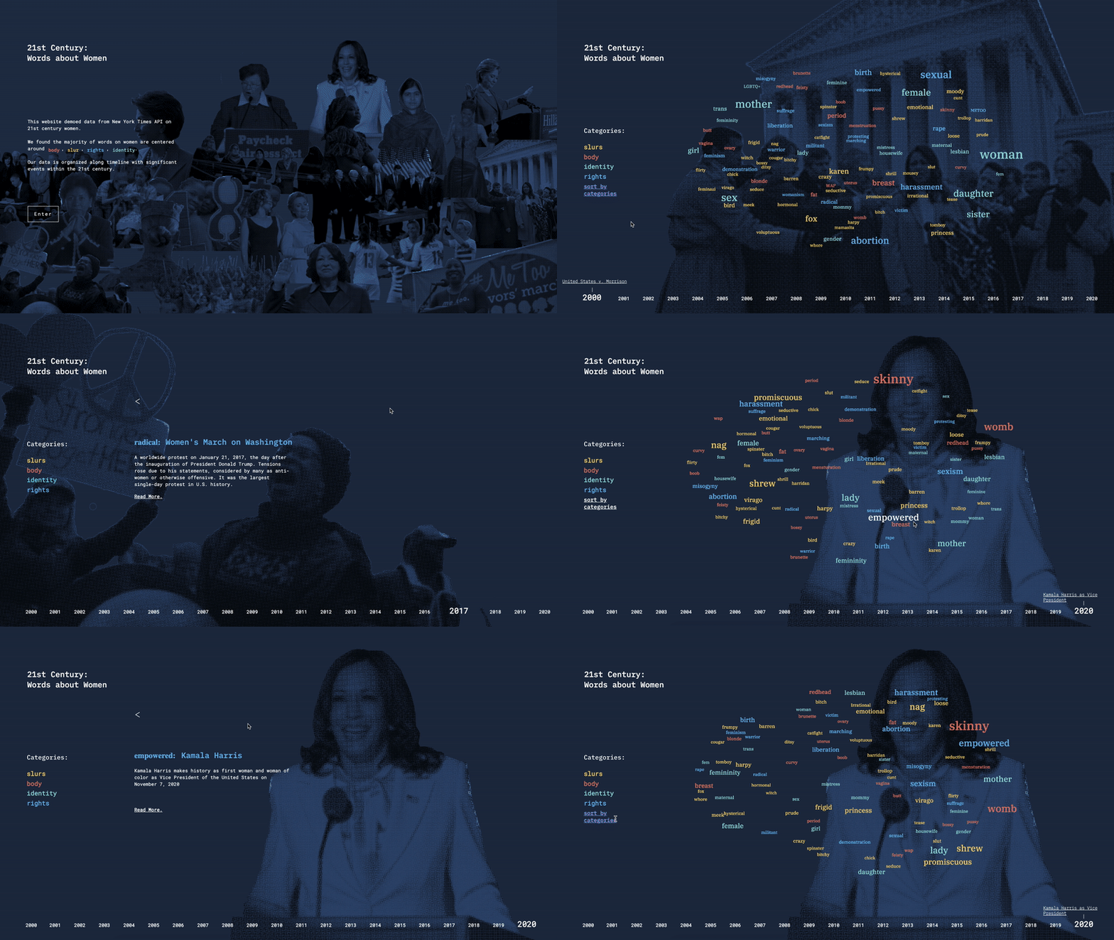
This project is a data visualization that presents the progress and significant events that have happened in recent years about women's rights and protests.
We wanted to do this by exploring the relationship between the frequency of words regarding women used in one of the US's most read newspapers, the New York Times (using the NYT article API to do so).
The words we selected from the articles were considered provocative in sexual connotation, relating to body parts, slangs about women, and types of shaming regarding women.
Timeline
October - November 2020
Tools Used
HTML/CSS/JS/p5js
NYT Article API
Collaborators
Yuran Ding
Margot Gersing
A Data Visualization On Women's Rights Throughout the 21st Century
Celebrate the achievements of women's rights and empower the future generation of girls
with computational data visualization
The Challenge
As a team of female designers, we shared personal experiences on the injustices we faced based on our sex and the stories we’ve heard from others.
This is a common topic that women still face today, and so we wanted to contribute to this conversation with a project that tells the world, with visual representation, of women's empowerment.
We hope that a user by just interacting with an interesting site, he or she may find a deeper message and reflect on the challenges women throughout time has faced, and learn something new.
Process
We decided the best way to do this was to find the word count of keywords we chose related to women over time. And due to the timeline we had for this project, I suggested to the team that we could focus our project to the 21st century instead for us to be able to create more details in our visual interactions.


Obtaining text metadata from the NYT Article API
We looked at different NYT APIs such as the archive versus article, and decided to use the latter because the article API provided us with information such as article snippets and summaries compared to the archive API which gave us a count of how many articles were written each year/month. Using this, we searched through each year between 2000 to 2020 on articles with our keywords (around 150 words).
Calculating word frequency with keywords
This information from the API was purely from a text file. I pasted this information into code that was able to do a word counting for us. Then by coping the word and word count information seen above into excel, I was able to transform the text into a JSON file to input into our visualization.


Word count translates into size of text
The JSON input file contains the keyword, its count in a year, as well as which word category it belongs in (we grouped our words into relating to Slurs, Body, Identity and Rights). This would directly translate into the size of the word that appears in our word cloud. The category determines the color of the word that appears.

Organizing hierarchy and user interaction
With the data part of the project mostly implemented, we began to refine our HTML/CSS layout. I realized the hierarchy we had in the beginning was not as effective in conveying the impact of our words in relation to the women's rights movement.


Hierarchy 1
I suggested our project be designed where when you click on a word in the word cloud, instead of the definition of that word, it would show a major event related to the word in that year, and then you could click on related articles. I felt that the words did not need a definition since many were common knowledge.

Hierarchy 2
Next Steps
Currently, when you click on any word in the word cloud, it leads to one word with the major event relating to that word. If we had more time, we would want to have each word or at least the largest words in the word cloud be interactive with its unique event description.


